The basic ingredients: Brownian Motions
There is no doubt that as simply as it might be, brownian motion is one of the most fundamental model in stochastic calculus. In this section, we will walk you through how to generate a series of brownian motions using our package.
Note
Before you jumpy into the details, please make sure that you have installed all the dependencies.
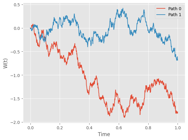
Generate Brownian Paths
To generate brownian motions, you just need to instantiate
a sde_class object. Let’s start by simulating 2 brownian
paths on the interval [0,1] with 1,000 time steps. In your interactive Python session:
import numpy as np
from sde import sde_class
from matplotlib import pyplot as plt

# Initialize an sde_class object
sde = sde_class(T=1, N=1000, M=2)

# Visualize the paths
plt.style.use('ggplot')
for path in range(2):
    plt.plot(sde.time, sde.W[path,:],
            label="Path "+str(path))
plt.legend()
plt.xlabel("Time")
plt.ylabel("W(t)")
plt.tight_layout()
You should get something similar to this:
Simple. Isn’t it?
Transform Brownian Paths
Although Brownian Motion itself is an interesting model, lots of statistics and physics models are constructed by manipulating Brownian paths.
In this section, we demonstrate how to transform simulated brownian paths via a user-defined function: \(\exp(t + \dfrac{1}{2}W(t))\) For this function, we can actually compute this expectation at each time point analytically: \(\exp(\dfrac{9t}{8})\).
Tip
Wondering how? Just remember \(W(t)\sim N(0,t)\)
# Initialize an sde_class object
sde = sde_class(T=1, N=1000, M=1000)

# Define the transformation function
def u(t, w):
    return np.exp(t + 0.5 * w)

# Transform
transformed_W = sde.transform_W(fun=u)

# Visualize the paths
# We only show 5 paths to avoid clutted plot
for path in range(5):
    plt.plot(sde.time, transformed_W[path,:],
            label="Path "+str(path),
            linewidth=0.5, alpha=0.7)

plt.plot(sde.time, np.mean(transformed_W, axis=0),
        linewidth=3, c='magenta',
        label="Average")
plt.plot(sde.time, np.exp(9*sde.time/8),
        linewidth=3, c='cyan',
        label="Expectation")
plt.legend()
plt.xlabel("Time")
plt.ylabel("W(t)")
plt.tight_layout()
You should get something similar to this:
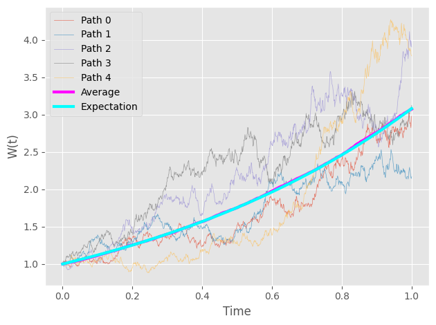
As you can see, the computed average is pretty close to the analytical solution.